my office makeover
Steve and I will have lived in our 1950’s cape cod for a total of 10 years this summer. We have done some remodeling and moving things around a bit over that span of time but one room was always ignored… our office. It had an old love seat (aka our basset hound’s bed), extra coffee table, Ikea saw horse desk and a small file cabinet. It worked but it was over crowed and not so pretty.
I think it was a combination of our office organization blog post, a way too long winter and our Rochester store facelift that inspired me to change it up finally.
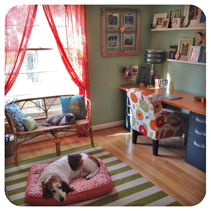
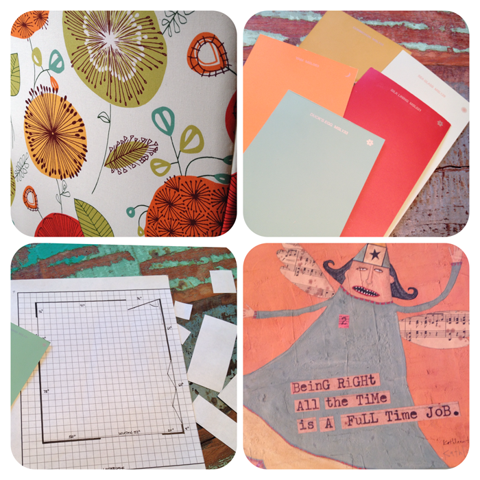 First… the inspiration. When I remodeled the shops recently I always began with a blank sheet of graph paper so I can see the space with fresh eyes. Even though this is a much smaller project, this helped me figure out what my options were for desk & furniture placement.
I’ve had this funny Kathleen Taylor canvas in our office for a while and have always loved the color story. It’s what made me paint the walls aqua and the desk top orange.
I like to collect other complimentary paint sample cards for accent color ideas.
And then there is my chair fabric. I know traditional office chairs are probably far better for body posture but I opted for the cuteness factor instead with this sweet slipper chair from target online. My friend chose something similar for her home office and after seeing it I knew I needed to say goodbye to my old office depot roller.
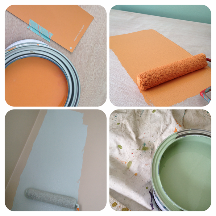 The colors I went with were from Miss Martha and were called Feldspar and Butterscotch. We wanted a double desk so we ended up buying two hollow doors and three filing cabinets to lay them on top of. I also rolled thin coat of poly acrylic over on the desk so it will wear a little better over time.
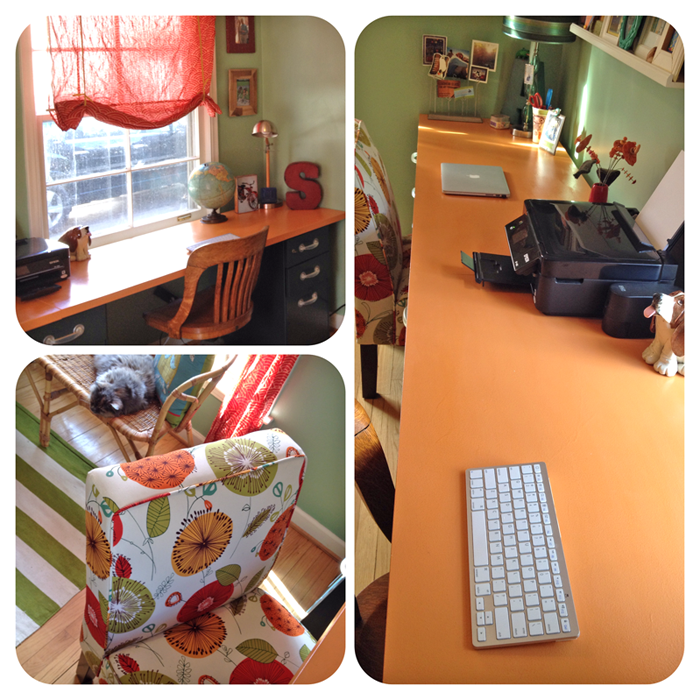 I originally planned on spray painting the used file cabinets an olive green, however the place I found on craiglists actually had three matching Steelcase ones that were already a muted teal green so they worked. (Please ignore the dirty window. Storms are coming off as soon as it stops snowing in April! arghhhh)
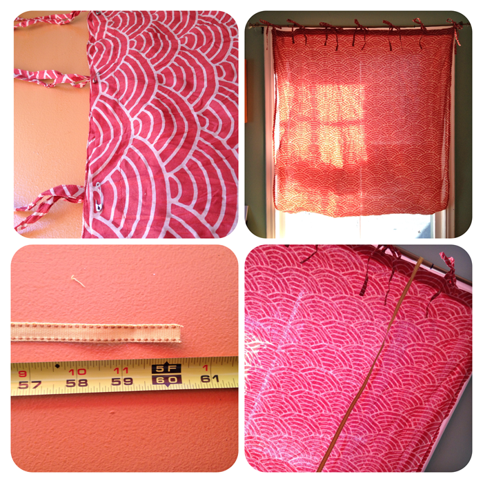 Speaking of windows… since the desk was flush against the one window I improvised by creating a my own ‘tie-up’ curtain. I’ve found Cost Plus World Market to have the cutest curtain collection. These were light weight so I folded them in half & safety pinned the bottom to the top.
I cut two 5 foot ribbons and looped them over the top.
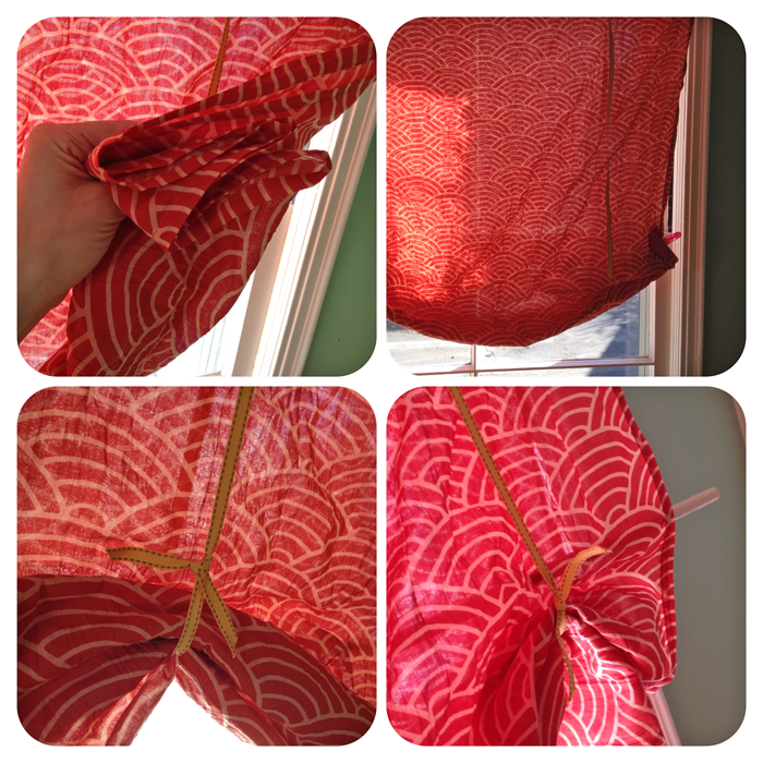 I accordion folded the curtain from the bottom a few times, clipped it in place then tied the ribbons to the desired length. I slipped a 1/2 inch dowel through to give it a little weight and voila ~ a cheap and easy tie shade with no sewing involved.
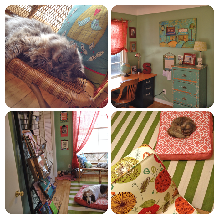 It was fun mixing up the patterns with complimenting colors. It just makes the office feel happy. The turquoise dresser was a flea market find and came naturally distressed painted that fabulous color. The rug and dog pad came from Home Goods. Steve’s office chair came from my mom’s basement (which could double for a flea market/antique shop)
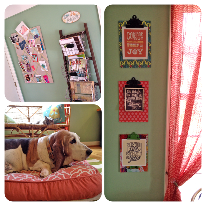 I couldn’t say goodbye to my old (Martha inspired) ribbon bulletin board I made in college so I snuck it in behind the door that is usually open all the time. I did add three colorful clipboards I got at our shop to display some quotes that currently speak to me. I like how easy they are to change out and update from time to time.
Gus has finally adjusted to being downgraded to a dog bed since he lost his couch. (He’s quite comfortable with his masculinity so he’s ok that with his pad being a little girly)
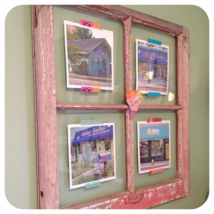
Since we removed all the old windows from our Rochester store during the facelift, I took some of them home to create large frames. This one was perfect for showcasing our four shops. The sculpted ceramic heart in the middle reads, catching fireflies and was made by my talented friend, Karen Fincannon.
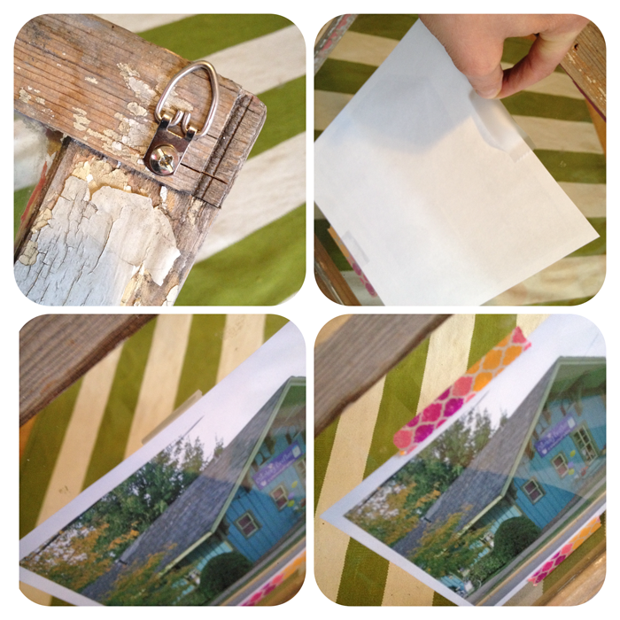 All I did was put a couple picture hanging hooks on the back of the window. I sized & printed photos to fit the panes and taped them to the backside of the window with scotch tape. For aesthetics I covered the scotch tape by adhering washi tape on the front of the window so it appears that it’s holding the photo in place… even though the image is really behind the glass.
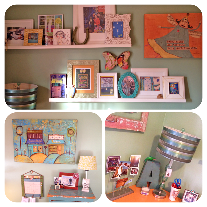 I’m sorta on a Ikea photo ledge kick lately. I like stacking a variety of frames, art and objects together in an organized, yet artful way. Steve commissioned this lovely painting of our two shops in Berkley by Kandy Myny of Bit O Whimsey for me a few years ago. It fits perfectly in our new office paired with with some vintage and new a.i. paper design wares.
This low cost makeover did take some energy and effort, but it has completely changed the feeling of the room. I spend quite a bit of time in this space and don’t know why I didn’t do it sooner. You should love where you spend your time. Sometimes all it takes is a gallon of paint, a few thrift store finds and a trip to Ikea to give your nest a new look…. well that and maybe a few fun treasures at catching fireflies too. ;-)
Like to see where I spend my time away from catching fireflies? Then sign up to receive blog posts like these in your email inbox HERE

Love the new office. So much energy. Would be fun to see a “before” picture. Thanks for sharing your creative process. I really like your blog. Just the right mix of words and photos.
Thanks Linda for your kind words! I tired a before photo but it was just so crowded it was hard to capture :-)
Love, love love the changes and can’t believe you’ve lived there for 10 years! Great idea on what to do with the old window I have in my garage – thanks for the inspiration April :) I hope to come see you in Ann Arbor soon!
Thanks Kara! WOW ~ Looks like you have a fabulous new business… LOVE it :-)